

Understanding plots in academic papers
Understanding plots in academic papers

Throughout my PhD, I was terrible at understanding and analysing academic papers. Each article was filled with jargon and assumptions I didn't know anything about.
It was an overwhelming challenge to understand a paper and reading them often had me questioning my own capabilities.
In this letter, I'll share with you a method to help comprehend academic papers. This approach is time consuming, and not how professors will approach a paper.
But we are not professors.
My goal here is to share a method for those relatively new to research which will aid in critically analysing the work of others. I reserve this approach for particularly significant papers.
Identify the axis units
Take a look at the plot below. It starts as just a set of axis units. You don’t need a figure caption, make your own assumption based on the figure axis units alone.
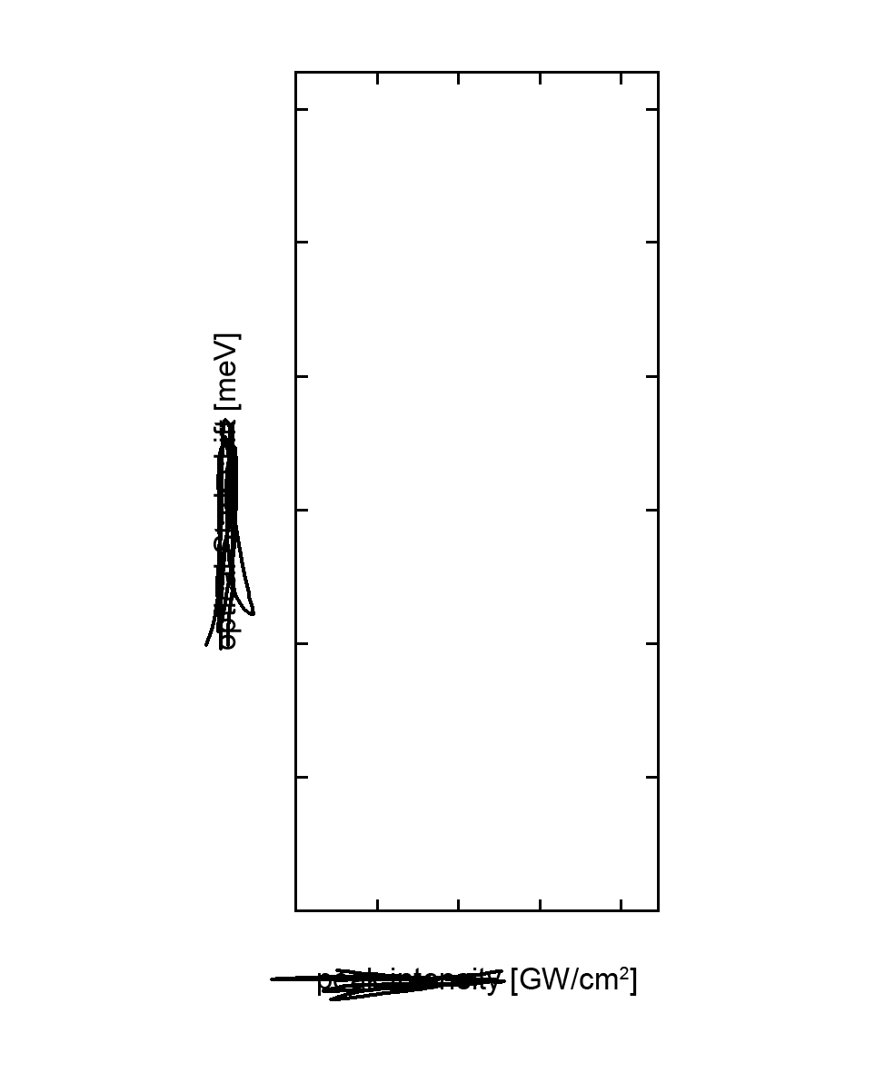
Without even including data, let’s first try to assume what we will be shown.
From the x-axis, with units in GW/cm2:
W is for Watt, a unit of power,
G = 109 (Giga) means large powers,
and /cm2 (per cm2) tells us these large powers are spread over some area.
From the y-axis, with units in meV:
eV is for electron volt, a unit of energy associated with electronic states, orbitals, and particles,
m = 10-3 (milli) means small energies.
Using just the axis units and knowing that the x-axis is what we change (independent variable) and the y-axis changes in response (dependent variable), we can infer the following:
This plot likely illustrates how minute energy changes in electronic states (or similar phenomena) vary with increased input power.
Data elucidates the relationship between the axis
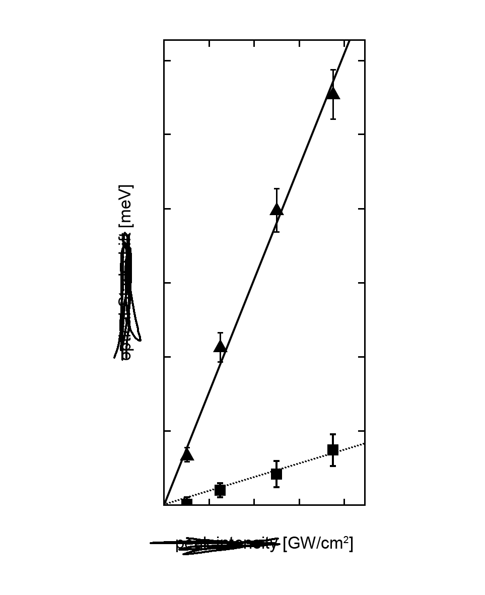
Now, with two distinct data sets and trendlines added, our assumptions evolve. Let's keep making assumptions of the above figure before I reveal what is plotted shortly.
From the data:
We infer there’s two datasets from the differing data point shapes and trendline styles (often colour-coded in a full-colour plot),
the data and trendlines show the small energy changes are increasing linearly with increasing input power,
but the rate of increase (the slope of the trendline) differs between datasets.
Using the understanding of the axis units we have established, and now the above interpretation of the data added to the plot, we can further develop our own interpretation:
This plot illustrates how minute energy changes in electronic states (or similar phenomena) increase linearly with increased input power.
Interestingly, between our first assumption based solely on the units, and our second assumption which included the data and trendlines, we've only learned that energy increases linearly with increased input power.
Meaning most of our interpretation of what is in the figure was achieved by simply understanding the units of the dependent and independent variables.
The data's role is to elucidate this relationship.
The big reveal
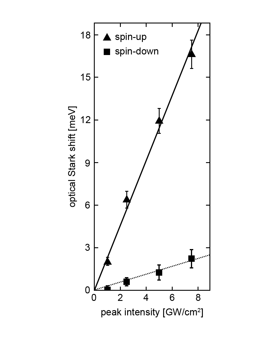
Electrons have a property called spin and behave like little bar magnets.
Electrons with spin-up (solid line) or spin-down (dotted line) are parallel or anti-parallel to a magnetic field pointed upwards.
The energy of the electron in its orbital (in meV) increases linearly with the peak field strength of the magnetic field (in GW/cm2), more so if it is parallel to the field direction.
If you've grasped this figure, congratulations you understand a key result of my PhD topic. However, I owe you an apology.
What I've done so far is perhaps condescendingly explained how a plot works. However, through this discussion of plot interpretation, my goal has been twofold:
First, to show how axis units alone can unveil most of what a plot is about.
Second, developing your own interpretation of the plot before reading about it in the figure caption or main text is the key to a thorough understanding of an academic paper.
Why is this approach beneficial?
By analysing figures independently first, the figure captions and the main text now serve the purpose of reinforcing or challenging your views (or filling in missing pieces).
This method empowers you, allowing you to view the work whilst restricting the authors' bias. Such agency - the capacity to form your own interpretations - is vital for critical academic analysis.
Over time, professors develop this skill innately. Their interpretations are rooted in extensive field knowledge, often pre-dating the paper itself.
While time-consuming to go through an entire paper figure-by-figure in this manner, this methodology is invaluable for newcomers to research or a field of study.
What to practice
Select a paper and start with its figures.
Compare your interpretations with the authors'.
Progress through each figure.
Finally, read the entire paper to understand the authors framework and story - how they've expressed the novelty and importance of their work.
In summary
This approach provides a systematic process towards understanding a plot within an academic paper, by purposefully crafting our own independent interpretations before reading the authors, to aid in the development of critical thinking skills.